Jet Star Signs

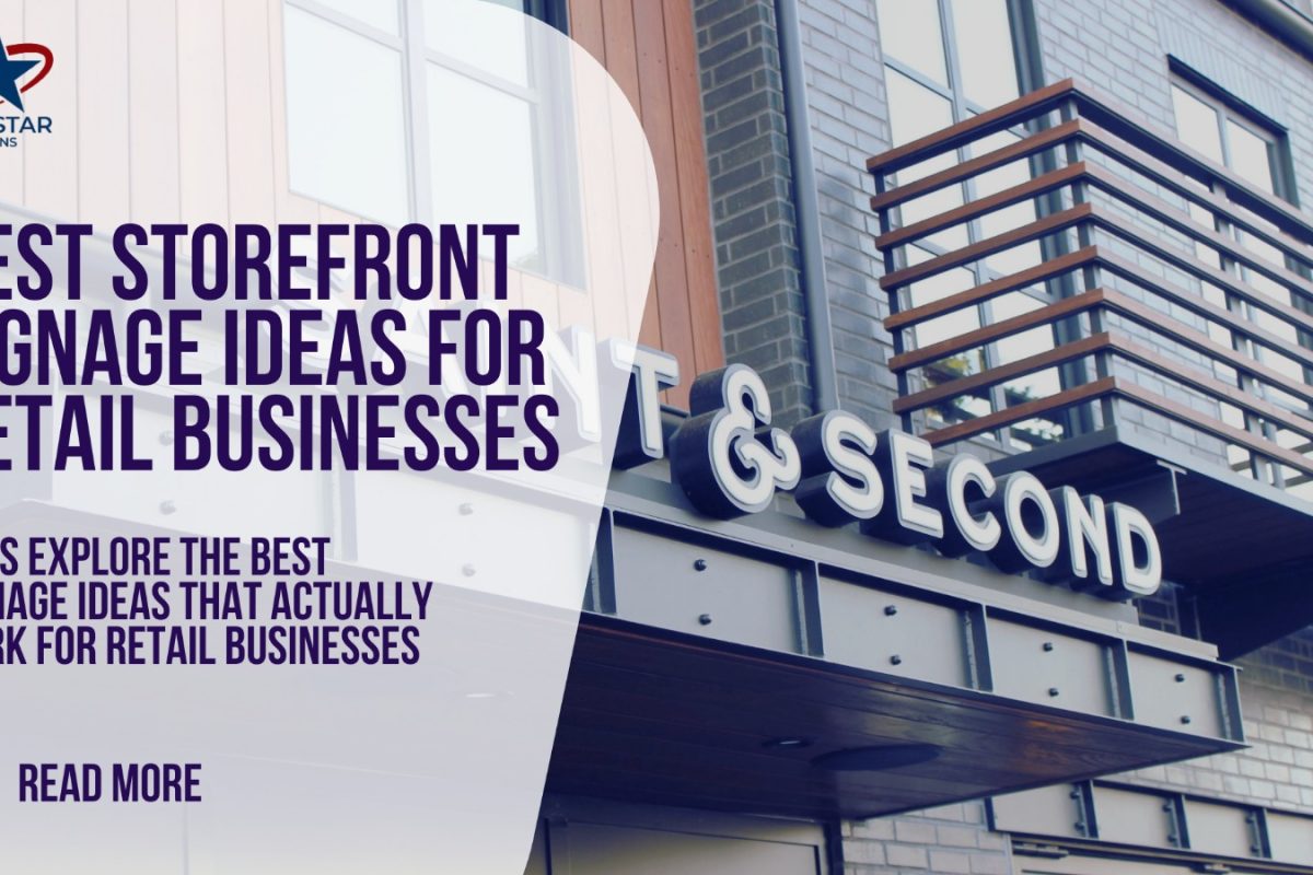
Jet Star Signs graphic on storefront signage ideas for retail businesses over a channel letter sign photo

Storefront Signage Ideas for Retail Businesses

Your storefront sign does much more than display your business name. It works as a silent invitation, welcoming people inside before a single word is spoken. Shoppers decide within a few seconds whether a store is worth a visit, and most of that decision is made from the sidewalk or the car.

When a sign is boring, outdated, or hard to read, many potential customers simply keep walking. You may have great products and competitive prices, but a weak storefront sign keeps people from ever finding out. A clear, attractive, well-designed sign, on the other hand, sparks curiosity, builds trust, and invites people in.

This guide covers the signage ideas that work best for retail stores today and how they turn passersby into paying customers.

Why Storefront Signage Matters More Than Ever

Retail shopping is no longer only about products; it is about the experience. Shoppers prefer stores that look friendly, current, and professional, and your storefront sign sets that tone before anyone steps inside.

Your storefront also appears in photos and videos on social media, in Google reviews, and on online maps. An effective sign helps more people find you in person and strengthens your presence online.

Storefront Signage Ideas That Work Best for Retail Stores

Different stores need different styles of signage. A technology store, a grocery shop, and a boutique will not all need the same thing, but a few options work well across most retail areas:

  • Channel letter signs: These make retail brands look stable, credible, clean, and professional.
  • Illuminated signs: Lit signs keep your store visible after dark and help people find it easily.
  • Window graphics: These are excellent for promotions, sales, and branding without taking up extra space.
  • Blade signs: Mounted perpendicular to the building, they are ideal on high-traffic streets where people walk past.
  • Neon or LED accent signs: These add personality and make a storefront more eye-catching, especially in fashionable areas.

How to Choose the Right Sign for Your Retail Store

The right sign depends on your brand and your location. If your store is in a high-traffic shopping area, visibility should be your first priority. If most of your customers are walk-ins, it is just as important that the store looks welcoming and current.

Your sign should also fit your store. An upscale boutique suits a smooth, minimal design, while a fun retail shop can use bright colors and playful lighting. When your sign, interior, and branding look consistent, customers remember you more easily.

Keep It Simple and Easy to Read

One of the most common mistakes retail businesses make is overcrowding the sign. Long messages and excessive detail do not belong on a storefront sign.

Good contrast, clear fonts, and the right size go a long way. If people have to slow down or squint to read your sign, it is not doing its job. Lighting matters too, because even a well-designed sign can fade into the background at night unless it is well lit.

Blending Style with Function

The best storefront signage balances style and function. Many stores combine several elements, such as a main channel letter sign with window graphics or accent lighting, to create a complete look. This layered approach helps a store stand out without feeling overwhelming.

Final Thoughts

The best retail storefront signage is visible, readable, and true to your brand. Illuminated displays, channel letter signs, blade signs, and window graphics all help attract customers when they are used well.

Your storefront sign is working for you 24/7. When it looks inviting and professional, it turns passing foot traffic into real shoppers.
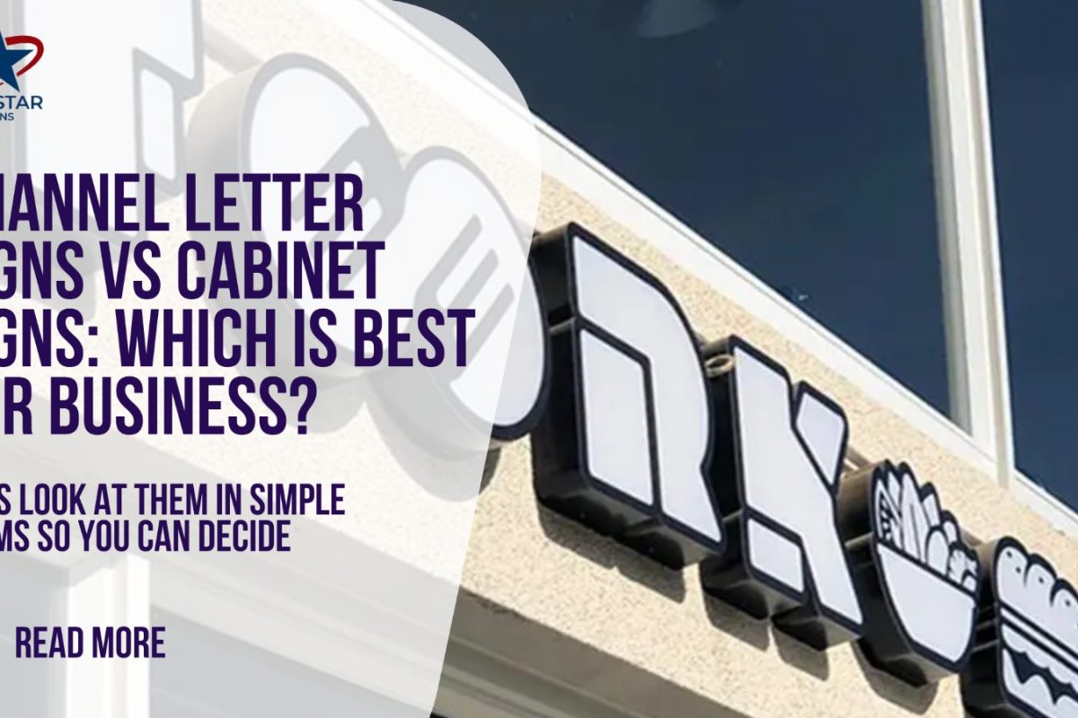
Jet Star Signs graphic comparing channel letter signs and cabinet signs over a storefront sign photo

Channel Letter vs Cabinet Signs: Which Is Best?

Your sign speaks for your business when someone is passing by. People make quick decisions, so a sign that is visible, appealing, professional, and clear can make them pause, take a photo, or look you up online.

Channel letter signs and cabinet signs are two of the most popular types of business signage. Both are effective, but they suit different needs. Here is how they compare, in simple terms, so you can decide what fits your business.

Channel Letter Signs vs. Cabinet Signs: Quick Comparison

Feature Channel Letter Signs Cabinet (Box) Signs
Main purpose Branding: a clean, premium look Visibility and readability from a distance
Appearance Individual 3D lit letters One enclosed box with a lit or printed face
Customization High: fonts, colors, lighting effects, layouts Lower: everything sits inside one box
Cost Higher: custom letters, more installation work Lower; faces can be swapped when you rebrand
Best for Storefront branding Strip centers and budget-conscious, high-visibility signage

What Are Channel Letter Signs?

A channel letter sign is made of individual three-dimensional letters, each a hollow metal “channel” with a face, mounted directly on a wall or on a slim support. Because the letters stand apart, the sign has a crisp, contemporary, and upscale look.

Restaurants, retail brands, shopping centers, and corporate offices rely on these signs. They look good on the street and in photographs, which matters in the era of Google Maps and social media.

Channel letters are usually lit with LED lights that use little energy. The light can shine through the front of the letters or glow softly behind them, a stylish effect that makes a business stand out, especially at night.

What Are Cabinet Signs?

Cabinet signs, also known as box signs, are built as a single enclosure. The box holds your business name and logo, and the whole face is lit evenly, which makes the message very easy to read, even from far away.

Cabinet signs are common at gas stations, fast-food restaurants, and big-box stores. These businesses depend on quick recognition, and cabinet signs deliver it. They are sturdy, heavy-duty, and built for varying weather. Cabinet signs are more about clarity and visibility than style, so they can look less modern than channel letters, but they are extremely practical.

Key Differences Between Channel Letter Signs and Cabinet Signs

  • Appearance and purpose: Channel letter signs are about branding. They present your business in a clean, professional way that builds trust. Cabinet signs focus on making sure your sign is visible and readable at a distance.
  • Customization: Channel letters offer more freedom in fonts, colors, light effects, and layouts. Cabinet signs are more limited because everything sits within one box.
  • Cost: Channel letter signs tend to cost more because they are custom-made and take more detailed installation. Cabinet signs are generally less expensive, particularly for large signs.
  • Maintenance: When one letter fails on a channel letter sign, it can often be fixed without touching the rest of the sign. A cabinet sign may need the whole box opened up.

Which One Is Right for Your Business?

Channel letter signs are usually the better choice when your business is in a high-traffic shopping center or on a shopping street and you want to look modern and professional. They help your brand feel recognized and memorable, and they photograph well, which helps with online listings and social media.

Cabinet signs can be more effective when your business is near a highway, a major road, or an open commercial area where people see signs from a distance. They provide clear, bright visibility with little distraction.

Both options can work very well; it depends on what your business needs most. Channel letter signs are worth the investment if you value branding, design, and a contemporary appearance. Cabinet signs are a practical and economical solution if visibility, simplicity, and budget are your main concerns.

Your sign is more than a name on a wall. It is a silent salesperson working for you day and night. Choose the option that helps your business get noticed and remembered.