Jet Star Signs

Top Mistakes Businesses Make When Choosing Outdoor Signage

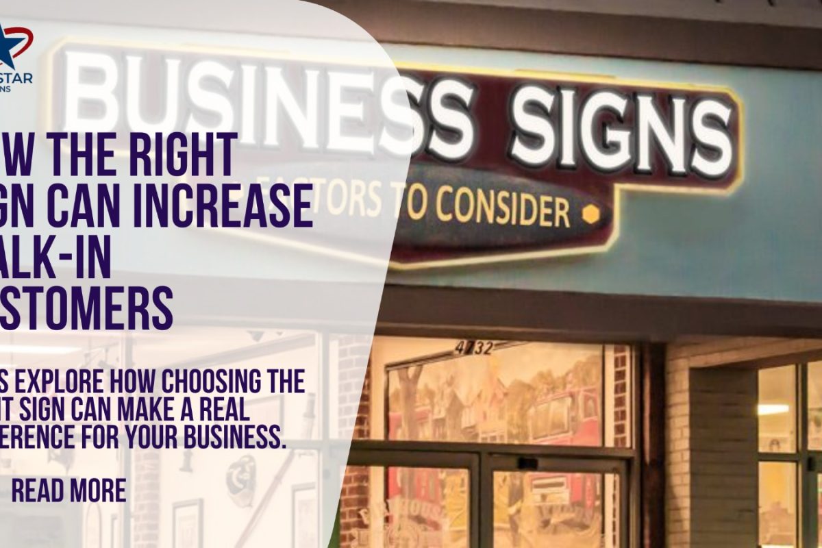
Choosing outdoor signage might seem like a simple task: pick a design, add your business name, and install it outside. But in reality, it’s one of the most important branding decisions a business can make. Your outdoor sign is often the first interaction people have with your business, and in many cases, it decides whether they walk in or walk past.

In today’s competitive environment, where customers are constantly exposed to ads, stores, and visual distractions, your sign needs to stand out instantly. If it doesn’t, you’re losing attention, and potential customers – every single day. The problem is, many businesses make small but costly mistakes when choosing their signage. These mistakes may not seem obvious at first, but over time, they affect visibility, brand image, and sales.

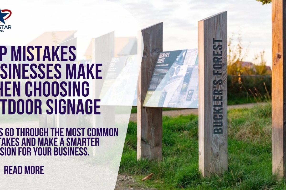
Let’s go through the most common mistakes simply so you can avoid them and make a smarter decision for your business.

Choosing Style Over Visibility

One of the biggest mistakes businesses make is focusing too much on how the sign looks instead of how well it works. A sign may look modern, creative, or unique on paper, but if people can’t read it quickly from a distance, it fails its purpose.

Where Things Usually Go Wrong

  • Fonts that are too fancy or decorative
  • Low color contrast between text and background
  • Sign size that’s too small for the viewing distance
  • Overly creative layouts that confuse the message

When these issues come together, your sign may look stylish, but it won’t be effective.

A good sign should balance style with clarity. It should look attractive, but more importantly, it should be easy to read at a glance.

Using Too Much Information

Another common mistake is trying to include too much on the sign. Business owners often want to add everything: logo, tagline, services, phone number, website, and even offers. While it may seem helpful, it usually creates confusion.

Outdoor signage works best when it is simple and focused. Your business name and logo are often enough. If you add too many elements, the sign becomes cluttered and harder to understand.

In high-traffic areas, especially, simplicity wins. A clean sign is more memorable than a crowded one.

Ignoring Location and Viewing Distance

Not all signs are viewed the same way. Some are seen by pedestrians walking slowly, while others are viewed by drivers moving at high speed. Ignoring this difference can lead to poor results.

If your business is located on a busy road, your sign needs to be larger, bolder, and easier to read from far away. If it’s in a shopping plaza, you may need something more detailed but still clear.

Many businesses choose signage without thinking about how far away it will be seen or how quickly people will pass by. This leads to signs that are technically good, but practically ineffective.

Poor Lighting or No Illumination

A sign that looks great during the day but disappears at night is a missed opportunity. Many businesses underestimate the importance of lighting, especially if they operate in the evening or are located in areas with low visibility.

Without proper lighting, your business becomes invisible after sunset. Even during cloudy days or bad weather, poor lighting reduces visibility.

Modern LED lighting has made it easier and more affordable to keep signs bright and clear at all times. Ignoring this can limit your reach and reduce walk-in customers.

Not Thinking About Long-Term Durability

Outdoor signs are exposed to harsh conditions, sunlight, rain, dust, and wind. Choosing low-quality materials to save money upfront often leads to fading, cracking, or damage within a short time.

A damaged or worn-out sign gives a bad impression. Customers may assume the business is outdated or not well-maintained. Over time, replacing cheap signage can cost more than investing in quality from the start.

Durability should always be a priority, especially in outdoor environments.

Final Thoughts

Outdoor signage is not just about putting your name outside; it’s about making sure people notice, remember, and trust your business. Small mistakes in design, placement, or material can reduce its impact and cost you potential customers.

By keeping your sign simple, clear, well-lit, and aligned with your brand, you can avoid these common mistakes and create signage that truly works. A good outdoor sign doesn’t just look nice; it actively brings customers to your door every day.

How the Right Sign Can Increase Walk-In Customers

Your business sign is often the first thing potential customers notice. It’s more than just a nameplate—it’s your silent salesperson working 24/7. In today’s busy streets and shopping areas, people make decisions in seconds. If your sign is hard to read, outdated, or unattractive, you could be losing customers before they even step inside.

On the other hand, the right sign grabs attention, builds trust, and invites people in. A well-designed sign doesn’t just show your business name—it encourages walk-ins, increases sales, and strengthens your brand. Let’s explore how choosing the right sign can make a real difference for your business.

First Impressions Matter

Customers form an impression of your business in just a few seconds. A bright, clear, and professionally designed sign suggests that your business is trustworthy, modern, and customer-friendly.

Even if you offer excellent products or services, a poor first impression can prevent people from entering. In today’s competitive retail and service environment, the sign outside your door often determines whether someone stops to check out your store—or keeps walking.

A strong sign can:

  • Make your business stand out from neighboring shops
  • Show professionalism and attention to detail
  • Encourage people to explore your store

Types of Signs That Drive Walk-Ins

The right type of sign depends on your location, audience, and business type. Some popular options that work well include:

  1. Channel Letter Signs: These are three-dimensional letters often lit with LED lights. They’re visible day and night and look modern.
  2. Cabinet Signs: These are enclosed signs with illuminated faces. They’re ideal for high-traffic streets and shopping centers.
  3. Window Graphics: Great for smaller spaces or to showcase promotions directly to pedestrians.
  4. A-Frame or Sidewalk Signs: Perfect for foot traffic and short-term promotions.

The key is visibility. Your sign should be easy to read from a distance, even in poor lighting or bad weather.

Design Tips That Encourage Customers to Walk In

A great sign does more than just show your business name. It communicates your brand personality and tells customers what to expect. Keep these tips in mind:

  • Clear, Readable Text: Fonts should be easy to read quickly, even from a moving car.
  • Contrasting Colors: Bright or bold colors stand out more and catch attention.
  • Simple Messaging: Avoid clutter. Focus on your business name and a tagline if needed.
  • Lighting Matters: LED lighting or backlit signs make your business visible day and night.
  • Brand Consistency: Use your brand colors, logo, and style so customers recognize you online and offline.

The Psychology Behind Signs and Walk-Ins

People are naturally drawn to bright, well-designed, and professional-looking signs. They subconsciously associate these qualities with reliability and quality.

A well-placed sign can also create curiosity. For example, highlighting a special offer or new product on your sign can give people a reason to stop by immediately. This “visual nudge” works especially well in areas with high foot or vehicle traffic.

Measuring the Impact

You don’t need complex tools to see if your sign is working. Track simple metrics such as:

  • Increase in walk-in traffic after a new sign installation
  • Customer feedback mentioning the sign
  • Sales changes during promotions advertised on the sign

Even small increases in daily walk-ins can quickly justify the cost of a high-quality, well-placed sign.

Final Thoughts

Your business sign is more than decoration—it’s a powerful tool for attracting customers. The right sign grabs attention, communicates professionalism, and encourages people to step inside.

By investing in a clear, modern, and well-designed sign, you’re not just improving visibility—you’re increasing walk-ins and building long-term trust with your customers.

Remember, your sign works even when you’re not there. Make sure it represents your brand well and encourages every passerby to become a customer.

If you want, I can also write a follow-up blog on “Types of Signs That Bring Maximum Walk-Ins” or a guide to designing high-converting business signs in the same easy and engaging style.

Do you want me to do that next?